NotesnookHELP
Introduction
This document reflects v1.0 of the Notesnook Theme specification.
The goal of this document is to provide you with an exact idea of what each scope, variant & color in the theme does, how they all fit together, and how you can use them to create your own custom theme for Notesnook. This document will also serve as a descriptive guide for any theme.json file you may find online.
What is a theme?
Even though Notesnook’s theming engine is quite flexible, there are limits to it. In Notesnook, a theme is like a skin: while you can change the colors of it, there’s no way to change other properties like size & layout. In other words, your theme will only affect the colors of UI elements like background color, text color, border color and so on.
But the question is, how granular can you get? Notesnook already had accent colors which allowed switching between 9 different “themes”. Is that the extent of customization allowed by the new theming engine or is there more? What are the possibilities?
Suffice it to say, you can change every part of Notesnook independently. This is made possible with the help of 3 things.
1. Scopes
Scopes allow you to independently theme various parts of the Notesnook app. Each scope represents a specific part of the app. For example, you can style the editor toolbar different than the rest of the UI. Since scopes never overlap with each other, you can style each part of Notesnook without worrying about the rest.
Here’s a quick schematic diagram of each scope used by the Notesnook Web app.
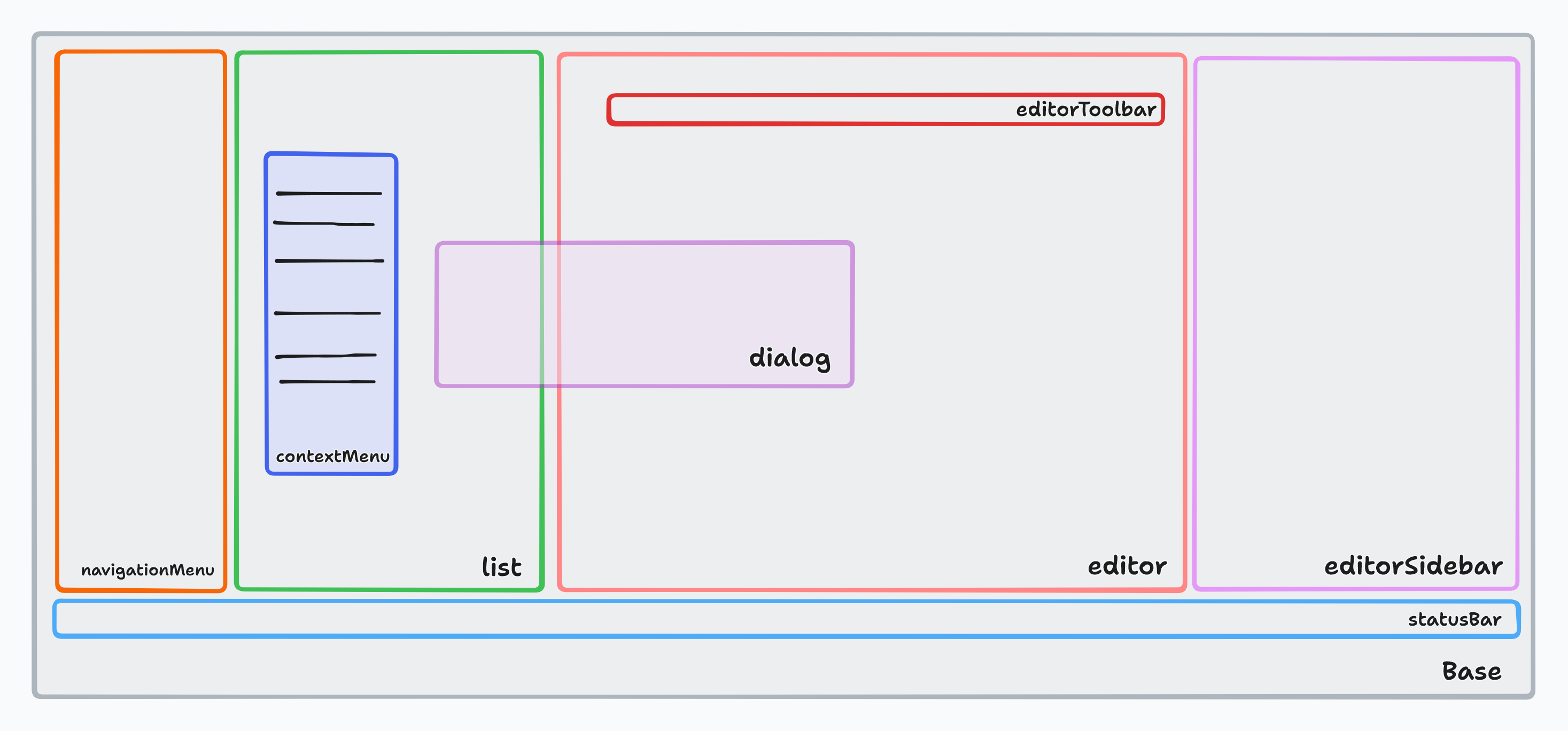
Currently, Notesnook has 10 scopes:
1. base
The base scope is the only required scope in a Notesnook theme. It must have all its variants & colors specified. base scope acts as the fallback for all other scopes. For example, if a Notesnook client cannot find a color in the statusBar scope, it’ll automatically take it from the base scope.
Here’s an incomplete list of areas that always use the base scope:
- Web clipper
- Login/sign up screens
- Email confirmation screen
- Settings (on mobile)
This allows you to change only the colors you need without any duplication.
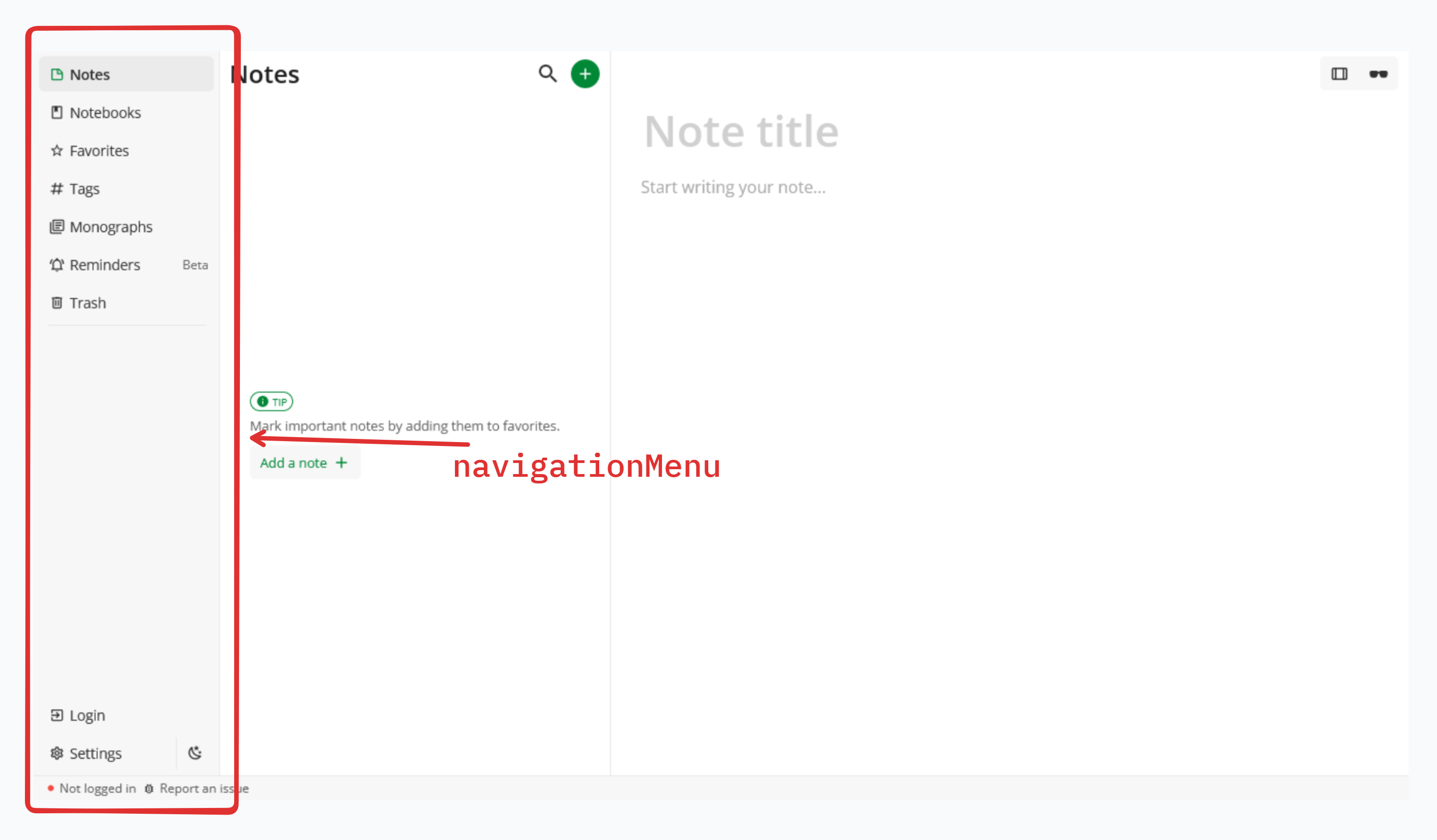
2. navigationMenu
The navigationMenu scope is used by the left-most side bar that contains the links to your Notes, Notebooks, Favorites etc.
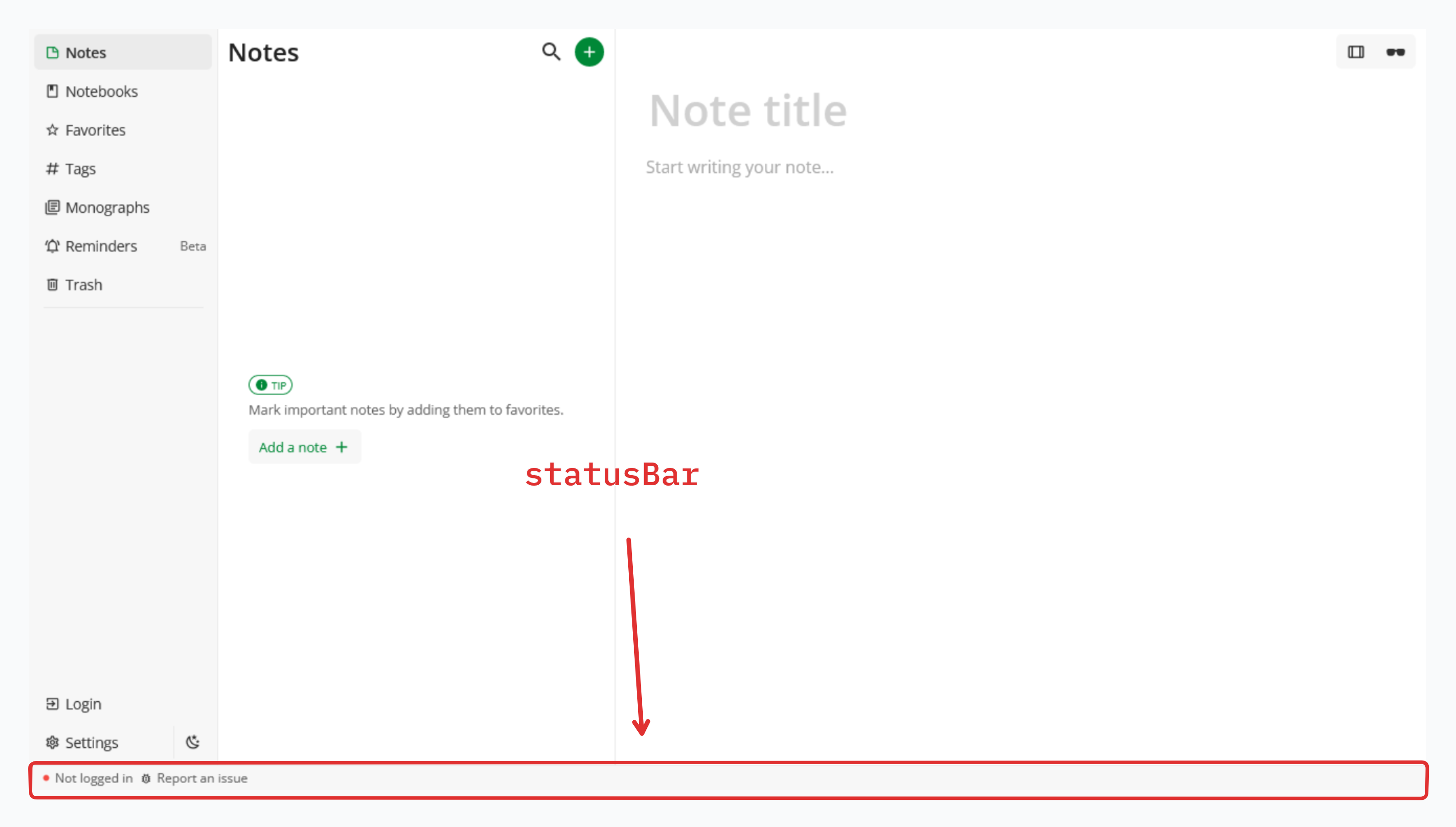
3. statusBar
The statusBar scope is used by the bottom most horizontal bar that contains your email address, the sync status etc.
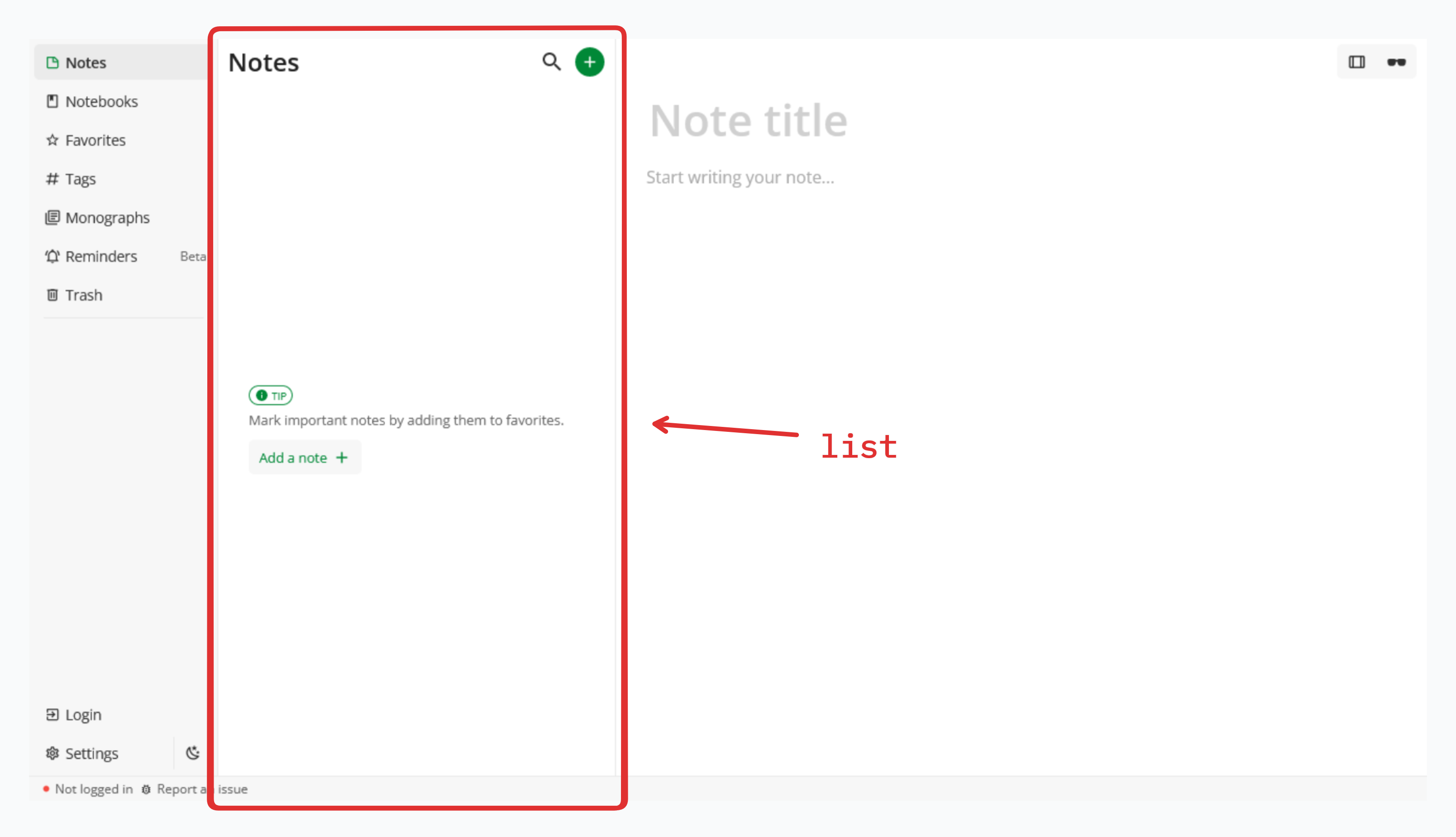
4. list
The list scope is used by the list of notes, notebooks & everything else that is in the middle pane.
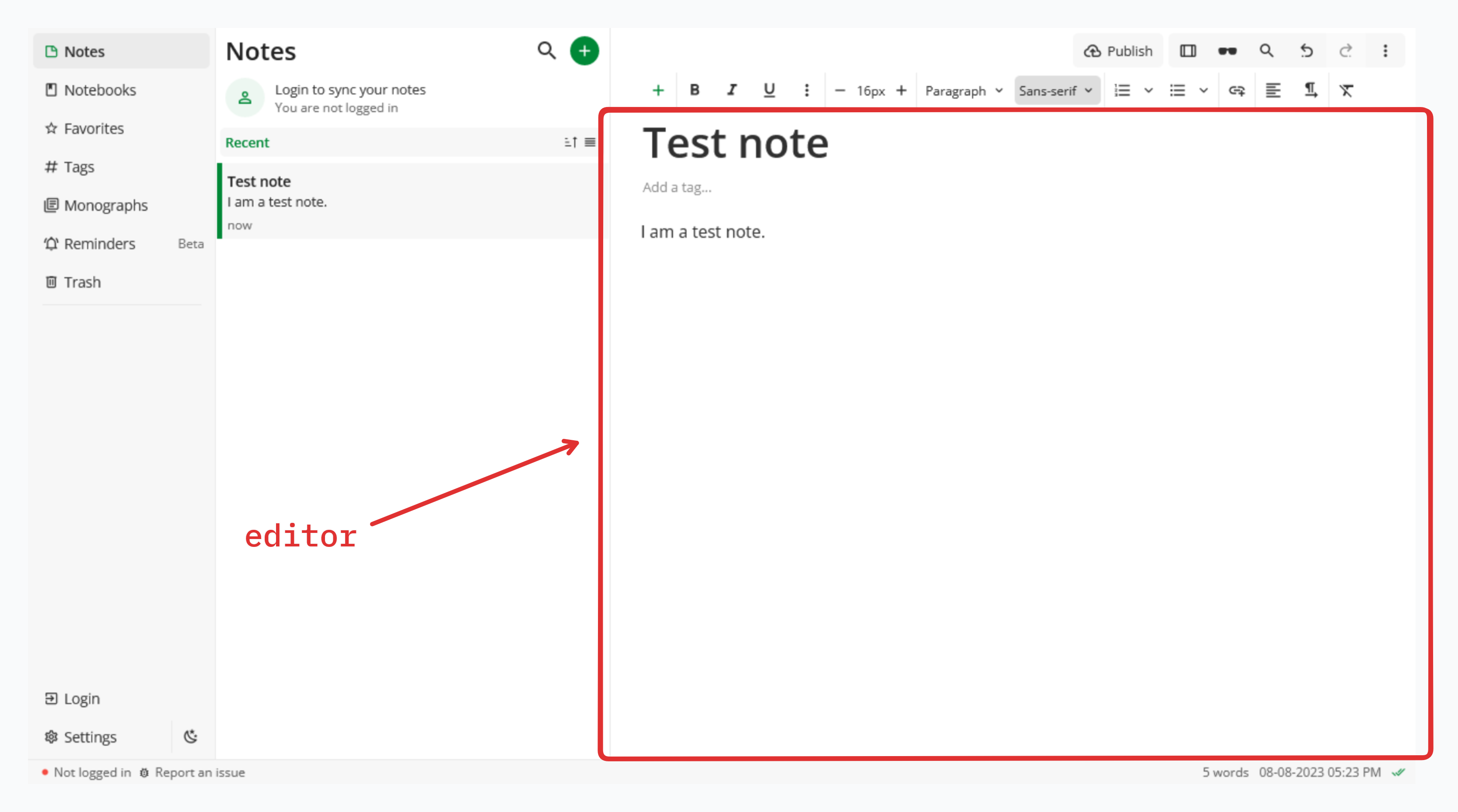
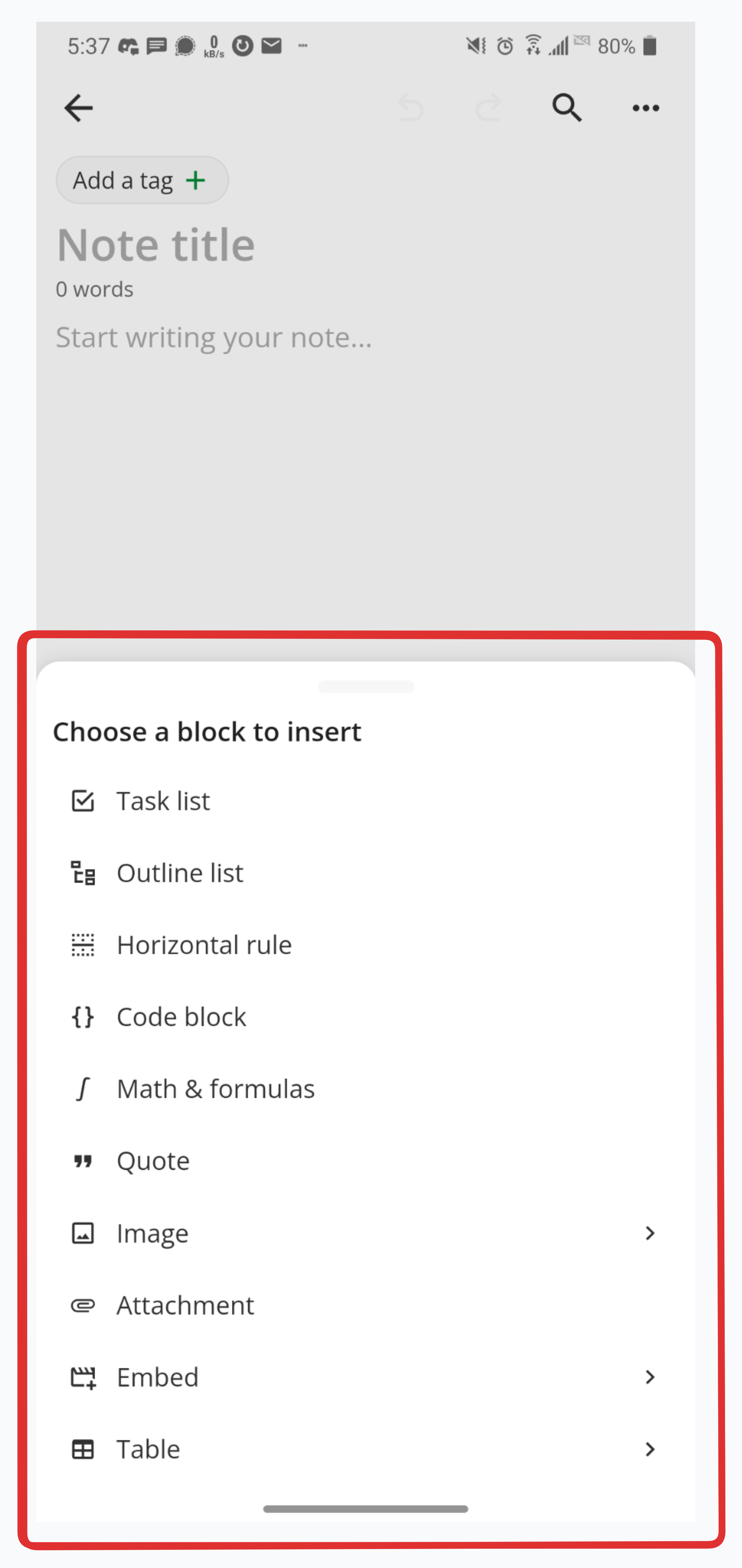
5. editor
The editor scope is used by the editor and everything inside of it like task lists, outline lists, tables etc. This scope does not include the editor toolbar.
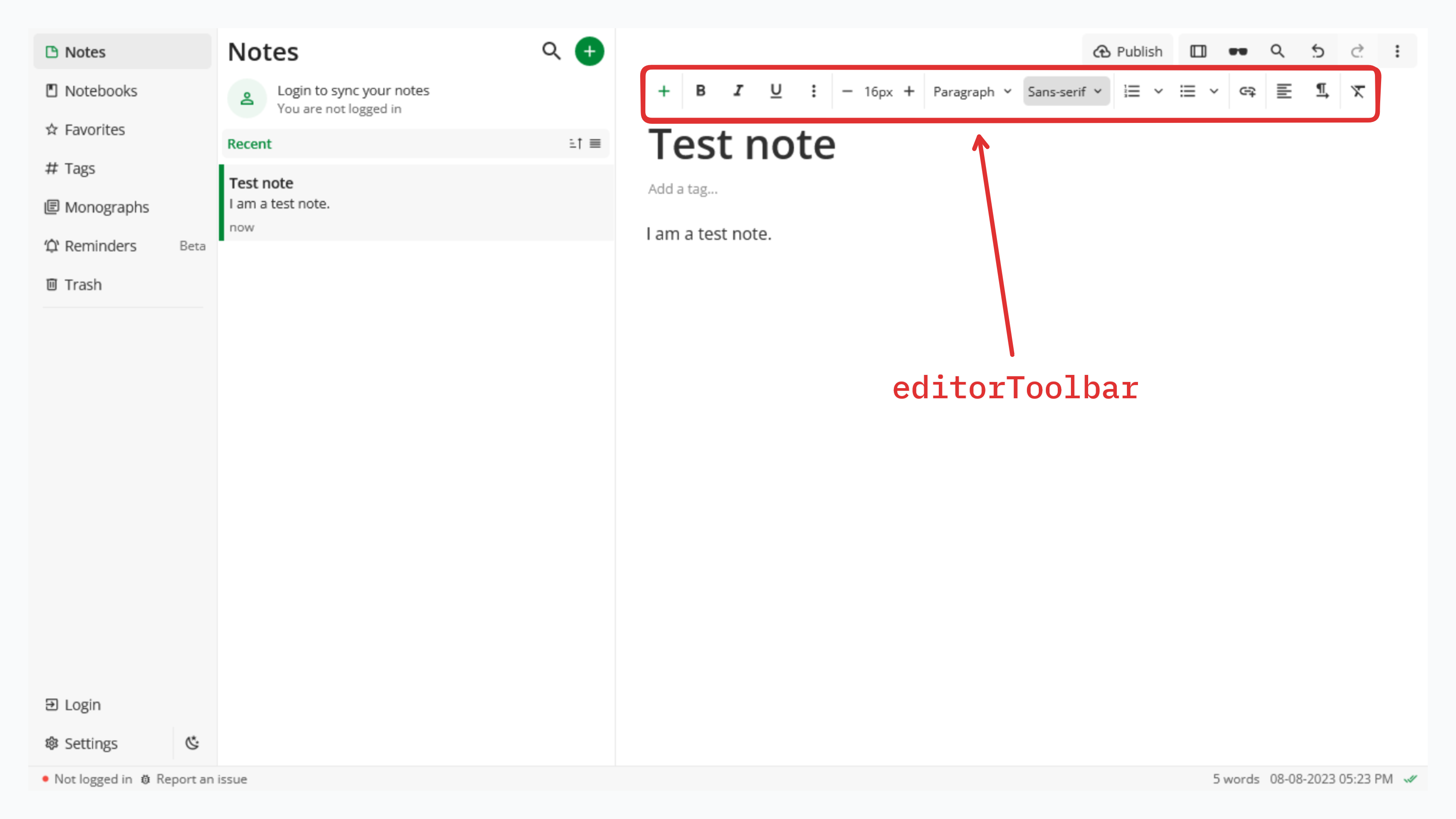
6. editorToolbar
The editorToolbar scope is used specifically by the editor toolbar for styling all its icons, buttons & menus.
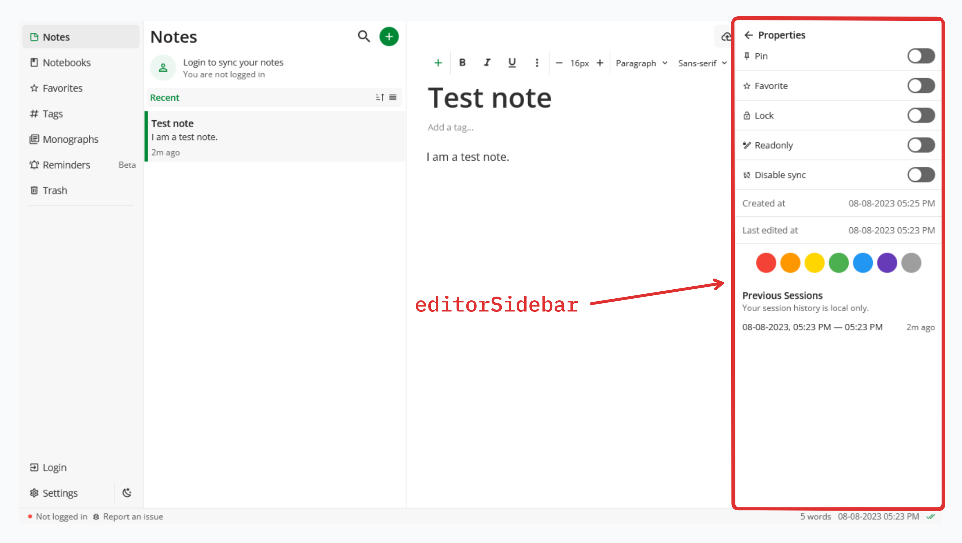
7. editorSidebar
The editorSidebar scope is used by the right-most properties menu, and the PDF attachments preview.
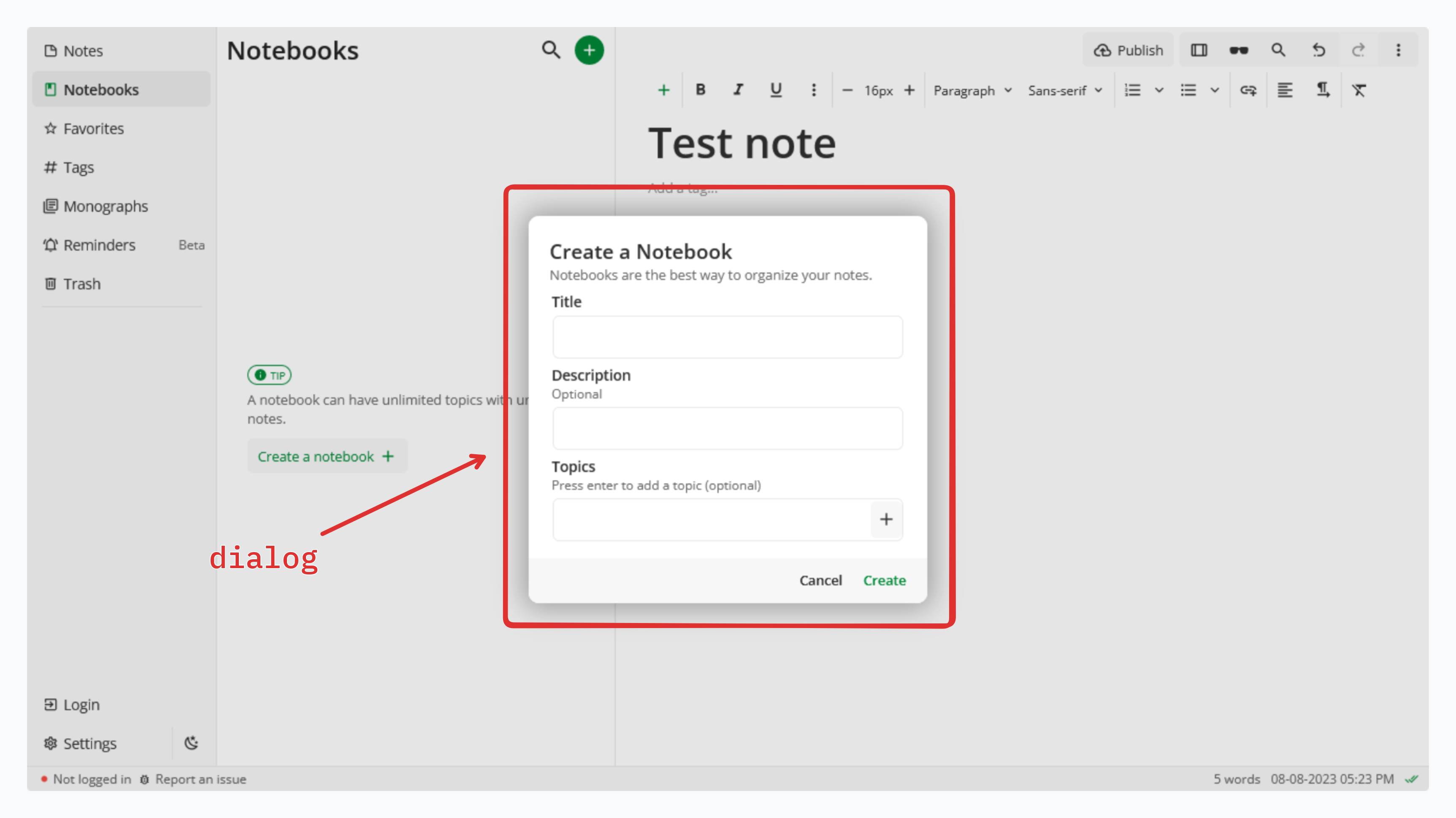
8. dialog
All the dialogs in the app, regardless of how they are triggered or what they contain, use the dialog scope. This includes the settings dialog, notebook creation dialog, reminder creation dialog etc.
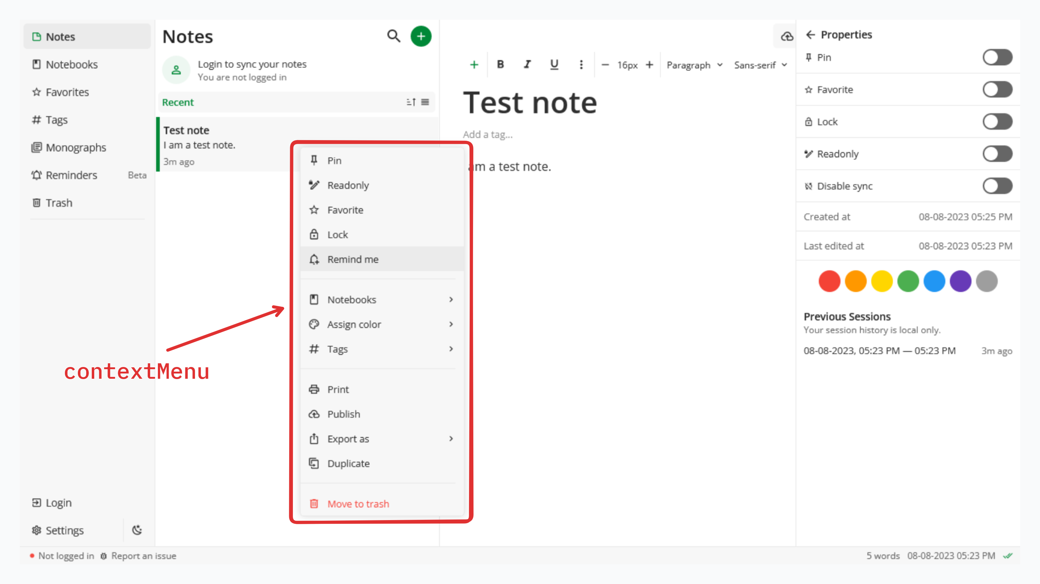
9. contextMenu
All the context menus & drop down menus in the app use the contextMenu scope. This includes the menus in the editor, list, and other scopes.
10. sheet
The sheet scope is a mobile specific scope, and is not used by the web app. It is used by all the popup action sheets displayed in the mobile app.
Each scope is further broken down into Variants.
2. Variants
Variants reflect either the state or importance of a UI element. Variants are NOT isolated and can be intermixed so it is important for a theme to have good contrast between the colors of each variant in order to avoid making some parts of Notesnook completely unreadable.
Currently, Notesnook has 5 variants:
primary
Theprimaryvariant is used by every element when it isn’t in any of the other states.secondary
Thesecondaryvariant is complimentary to theprimaryvariant. It is used in places to show elements or text of less importance. For example, the text12h agoshown under each note item uses theparagraphcolor from thesecondaryvariant.selected
This variant is used throughout the app for all elements in selected, toggled, or focused state.error
Theerrorvariant contains colors for showing errored status anywhere inside the app. It is possible that the UI element using this variant may make use of colors from other variants.success
Thesuccessvariant contains colors for showing success status anywhere inside the app. It is possible that the UI element using this variant may make use of colors from other variants.
Each variant further contains a total of 12 Colors:
| Color | Description | Transparent |
|---|---|---|
accent | Color used to make something stand out (like the primary button in dialogs). Can be both background or foreground. | ❌ |
accentForeground | Color for icons & text on accent background | ❌ |
background | Background color of elements | ❌ |
paragraph | Color of paragraphs and other text | ❌ |
heading | Color of headings & titles | ❌ |
backdrop | The color of the overlay shown behind dialogs & modals | ✅ |
hover | Background color when hovering over elements (that support it) | ✅ |
border | Border color | ❌ |
separator | Color of the separator line between items | ❌ |
placeholder | Color of the placeholder in input fields | ❌ |
icon | Color of icons | ❌ |
Theme Metadata
name: the name of the themedescription: a short description of the themeid: a unique alphanumeric id of the theme. Must be unique across all other themes.version: version of the theme (you must increment this on every new change of the theme)authors: one or more authors of the theme.compatibilityVersion: The compatibility version of the theme used by the client to decide whether the theme is supported by the current client version.license: the license under which the theme can be shared, modified etc.homepage: website or homepage of the themecolorScheme: “light” or “dark”tags: keywords to help categorize the theme & improve search results.